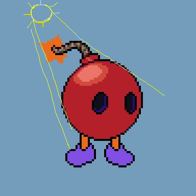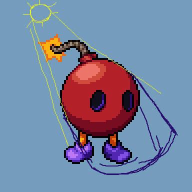
Pillow shading is generally thought to be the result of each individual part of a piece being shaded independently and without considering a light source or the other parts of the thing being shaded. The "highlights", if there are any, sit directly in the middle of the part being shaded, and then the shading radiates outward from there. Sometimes it's uniform across a whole shape, sometimes it's quite minimal and ends up looking like a blurry outline.

The issue arises when the artist wants to create a feeling of depth, but hasn't taken the time to decide where the light is coming from. While the light could technically be coming from straight ahead, from us, the light seems to hit everything evenly, ignoring shape and size and texture.

To improve your shading, first pick where the light is coming from. Directly above and top-left are the easiest to imagine, with top-left being a little more interesting to look at. Imagine the light is a bunch of small balls hitting your object; what gets hit directly and what might only receive a glancing blow?

Next, figure out where the light isn't going to reach; the places where few if any balls are going to touch. The further a point is from the nearest collision, the darker it'll be. With pixel art, you generally want to use shading sparingly so as to not overload the piece, so play with the amounts of shading using this principle as a guide.

Ultimately, you might find that the piece looks better if you don't follow the "rules" with absolute strictness. Maybe you want a certain part to have a little more, or a little less, light than it realistically would. These are guidelines more than anything, a helping hand to create more interesting and more 3-dimensional art.


