


First things first, these are just some general guidelines. Once you get a feel for how you want to do things you'll be able to start playing with it a bit more and get kinda weird, but this will give you a really solid starting point. For the most part, my colour palettes form through necessity; I need green so I grab some greens. If the colours I already have don't cover what I'm trying to do, I'll add a few more.
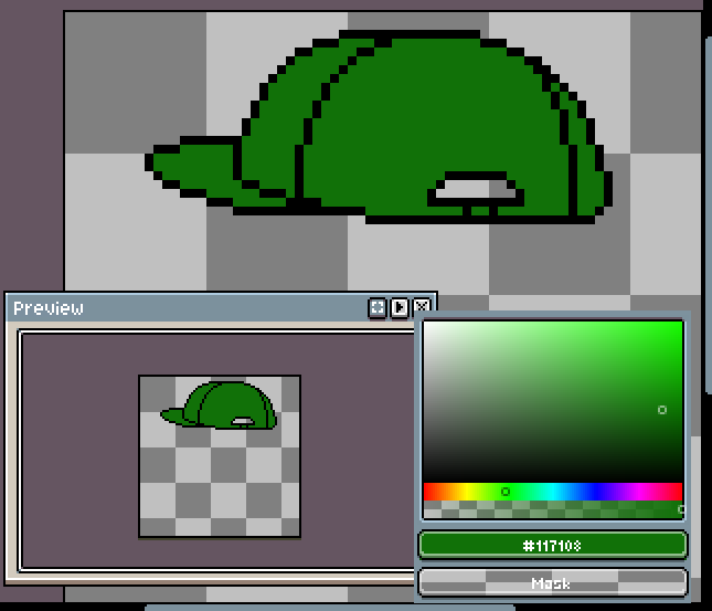
Let's say I need some green shades for a hat I'm doing. I'm thinking of a medium value (darkness), decent saturation, real middle of the road green. That's going to be my base colour, the one that most of the pixels should be.
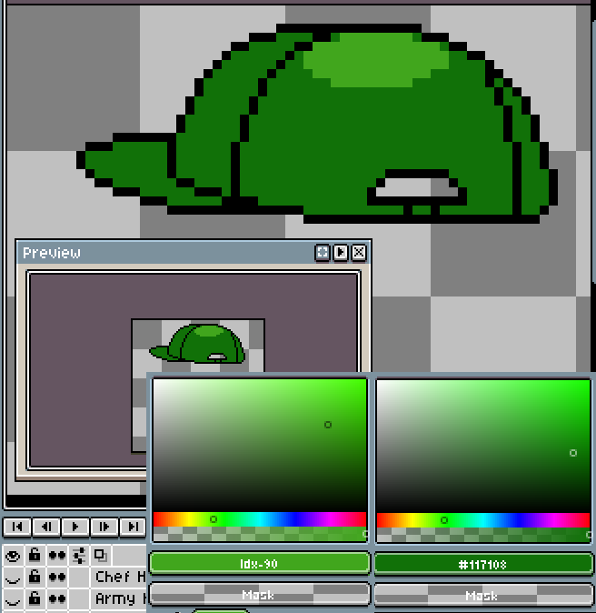
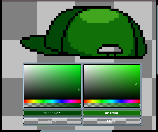
For a highlight shade I move the hue a little closer to yellow (or, alternatively, away from blue), desaturate it a bit, and obviously bump the value. You get a feel for this over time, but you want it to be noticeably different without being distracting.
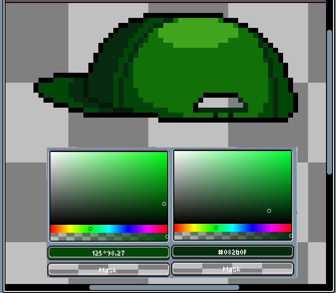
For the shadows I do the opposite: lower the value, bump the saturation a little, and move either towards blue or away from green. If you require another darker shade, do the same again.
These rules pretty much apply no matter the saturation, value, or hue of your base colour. There may be occasions where you need to get shift one value by more or less than usual but these work as general rules. Good luck with your pixel art, and I can't wait to see what you do with these tips.

